A December 2014 addition to our library of themes, Radcliffe stands out with elegant yet modern fonts, large featured images, and clean navigation that gets out of the way and puts your content front and center.
Radcliffe looks great right out of the gate, but it's also got beautiful bones. These five bloggers have five very different styles, but Radcliffe works for them all -- you see their work and personalities, not their theme.
Twenty-year-old UK native Ollie uses his blog to chronicle his travels as he explores his new home country, Canada.
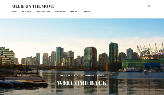
Radcliffe's full-width images and classic typography let Ollie's beautiful images take center stage. His focused, organized menu helps visitors find their way around quickly and easily.
Custom headers are an easy, free change that can transform the feel of an entire site. Catherine Jue adds a simple but bold text-based header to her blog, Cat(herine):
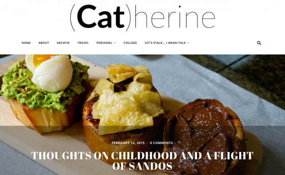
She relies on the same full-width images, focused menu, and beautiful fonts to build her striking site, but the simple addition of a header adds an informal, fun-loving note perfect for this California gal's personality.
Header images can work just as well -- take a look at mmitII:

Blogger Matt Ballantine wisely chose a wide photo with strong horizontal lines. Echoing the header's colors in his posts' featured images keeps his blog from feeling busy -- the images work together rather than compete.
(If you're using the newer Site Logo feature instead of a header, Radcliffe handles that as well; just check out Tales of a Greenwood.)
Add a Header, Change the Fonts: dutchie love
Nicole and her husband Nathan both come from Dutch backgrounds -- hence the name of Nicole's lifestyle blog, dutchie love:
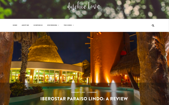
She transforms Radcliffe, removing the default site title text and replacing it with a soft header image with her blog's title in a fun font. Going a step further, she used Custom Fonts to change her title font to the punchy, retro-modern Brandon Grotesque and her menu and body to Avro, a fuss-free serif.
Add a Header, Change the Fonts, Update the Colors: Simul Blog
If you're getting the impression that Radcliffe works best for image-heavy blogs, friends Rich, Jacob, and Dan of Simul Blog beg to differ:

Simul Blog packs a saturated punch: a stark header image, brash oranges, and the aptly-named Chunk font turn Radcliffe into a minimal but high-impact home for their theological musings.
Want some more theme-spiration? Check out these stunning sites:
- Jonas Rask Photography: a scaled-back header helps Jonas's photos shine.
- Reverse Retrograde: uber-thin sans serif fonts are streamlined and modern.
- Sheer Stomping: a bold header and stripe of black keep this lively fashion site grounded.
- Cultrbox: a splash of color in the site logo adds a pop of personality.
- Omar Shahid: a pared-down look creates a focused home page.
Ready to give Radcliffe a try? Head to the Theme Showcase to activate it on your blog.


0 comments:
Posting Komentar